


Digital markets know the importance of effective ad campaigns. In fact, paid ads and Google Ads (in particular) remain one of the key pillars of a comprehensive digital marketing campaign. So, how does one improve the performance of their ads? More specifically, does one improve landing page conversion rates?
What is a landing page?
First and foremost, does your digital advertising does not rely on landing pages? If not (and you are not satisfied with the current performance of your ad campaigns), then ask your team immediately why you are not using landing pages.
So, what is a landing page?
A landing page is the page on your web site that you send visitors from an ad. Landing pages act as the first impression from an ad, so there intent is to initiate a conversion. Furthermore, effective landing pages frequently are comprised of a standalone page with one singular focus. Effective landing pages include one call to action (CTA) aimed at your target audience.
According to The Landing Page Course:
“Landing pages live separately from your website and are designed to only receive campaign traffic. As we’ll see, this separation allows them to be focused on a single objective and makes analytics, reporting and testing a simpler task.”
Although some companies utilize existing pages from the site (or even their home page), the most effective pay-per-click (PPC) ad campaigns send traffic to dedicated landing pages. After all, the purpose of a PPC campaign is to drive sales, so you want potential customers to act. Additionally, complete digital marketing strategies leverage other components to drive general awareness and adoption. If you are seeking more awareness, then pull another lever, such as content marketing.
To drive sales, pull your PPC lever and send traffic to a dedicated landing page to make them act!
What are the main elements that will help improve landing page conversion rates?
Primarily, landing pages serve one objective. They target a specific offering and act as the first impression for a specific audience. But, what are the main elements of an effective landing page and what is a good conversion rate?
First, in order to improve your conversion rate, you must understand if you have a good conversion rate. However, conversion rates differ by industry, so understanding your industry and KPIs help you know if you actually need an improved landing page conversion rate. Fortunately, Top 10 Website Hosting offers some additional details.
“The absolute reality of a good conversion rate is hard to define. It varies from country to country, by region, users, etc. And of course, all of this is based on a wide range of statistics from different sources. Econsultancy’s Performance Benchmarks tool gives a range of 1-3% as an average ‘good’ conversion rate…It’s important to put together your own KPIs by taking the average eCommerce conversion rate within your industry. However, be mindful of competitors, as their conversion rates may not represent a reasonable sample.”
The team at Crazy Egg, a company that helps other companies analyze and understand their websites, outlines the essentials.
-
Creative Copywriting that Features a Crafty Headline
Headlines captures a visitors attention and compels them to act. The headline must grab the reader’s attention and tell the reader what the product and/or service is about.
Pro Tip: “The headline should be short. Never make it more than 20 words, and preferably limit it to 10. It’s also worth noting that if your headline complements an image that explains the product or service, then you don’t need to go into quite as much detail in the copy.”
-
Quickly Add Context with Subheaders
The subheadline quickly adds some brief context to the headline and works to make a visitor stay on the page. Effective subheaders contain some element of persuasiveness and typically remain positioned directly under the header.
Pro Tip: “If the headline makes the visitor look, then the subheadline should make them stay. Together, these pieces of copy make up the one-two punch of a landing page’s power. And the subheadline can go into slightly more depth and detail than the main headline.”
-
Pictures are a Must
A picture tells the story of a thousand words, so features relevant images on a landing page is a must. For example, pictures must be large, relevant to your product or service and high quality.
Pro Tip: “Visual content is an essential component of landing pages that work. As you determine what to include, keep the focus on high-quality, relevant visuals. This is not the place to feature stock photographs or last-minute Photoshop jobs.”
-
Clear and Concise Context
Including clear and concise context that quickly explains your offer is another main element of an effective landing page that helps improve conversion rates. After all, if a reader is confused about the product or service offering, they are unlikely to convert.
Pro Tip: “Your explanation can be integrated with your headline, or completely separate. An explanation should be benefit-oriented. Explanations are functional, but the functionality should be tilted in favor of the user.”
-
Target a Pain Point
Discussing pain points in a landing page helps conversions because we, as humans, are wired to avoid pain. For example, if the content mentions something the reader may lose, they subconsciously seek relief (i.e., your product).
Pro Tip: “Essentially, you want to illustrate a pain point your reader might be experiencing. Then, draw the conclusion that your product or service provides the answer to that pain. Be sure to relieve the pain. Your product or service is provided as an antidote to the pain. Don’t present a problem without providing a solution!”
-
Target a Pleasure Point
The corollary to discussing a pain point is adding context about a pleasure point because we are also wired to seek pleasure. Therefore, include how your product or service provides pleasure or meets an emotional need (beyond its core functionality).
Pro Tip: “To illustrate how this might work, imagine that you’re selling arthritis-relief medication. On the surface, you’re selling a pill. But you’re not just selling a pill. You’re selling freedom, relief, and joy. The same principle can be applied to many different products.”
-
Correct Contact Information
Ensure your landing page includes visible and accurate contact information. After all, you want people to convert and/or contact your company for more information. So, be blunt and include all relative points of communication with your potential customers.
Pro Tip: “Some of the most persuasive landing pages have multiple methods of contact, including a phone number, a physical address, an email address, and a contact form. Some even have popups where a customer service representative asks me if they can be of help. These go a long way to help strengthen trust in the company and eliminate any friction in the conversion funnel.”
-
Add a Guarantee
Interestingly, simply adding the word “guarantee” helps improve landing page conversion rates. Why? Customers love them and regardless of how they are presented, they help provide reassurance in your company. Additionally, guarantees can take many forms. So, choose any type of guarantee that works for your business type, and state this guarantee on your landing page.
Pro Tip: “Position your guarantee statement close to the CTA. This proximity will help the potential customer receive a final bit of assurance, and be ready to convert. In the absence of any explicit product guarantee (e.g., satisfaction, money back, etc.), you can provide a different type of guarantee (e.g., 100% No Spam Guarantee).”
-
Prominent and Powerful Call to Action
Perhaps the most important and crucial element that helps improve landing page conversion rates remains the CTA. And many companies simply skip or wimp out on this essential element. So, include big (the bigger the better) and compelling copy within the CTA!
Pro Tip: “The actual CTA copy is the most significant copy on your entire landing page. Don’t use the word “submit.” Instead, use something explosive, exciting, and persuasive. Use a button. People have been trained to expect the CTA to be a button. Use a contrasting color. Your landing page, your company, your stylebook, and your designers all have certain colors that they like. Your landing page has a color scheme.”
How do you know if you need to improve your landing page conversion rates?
First, check your sales numbers. Prior to jumping into performance, measure how your company is doing and your initial goals or assumptions with a certain project. Next, review those assumptions against the relative performance.
For example, a naive small business owner may expect a 50% conversion rate with their PPC campaign because that is their word of mouth conversion rate. This is not a realistic assumption, so understanding the relative (and realistic conversion rates) helps.
The team at Unbounce offers some context to help manage your expectations because average conversion rates vary. In particular, they vary by industry, so it is important to gage your performance against your niche and not the overall market.
“For example, if you’re in higher education, a conversion can look very different from a company in the legal industry. So, instead of asking “What’s the average landing page conversion rate?”, you should be asking“What’s the average conversion rate for a landing page by industry?”
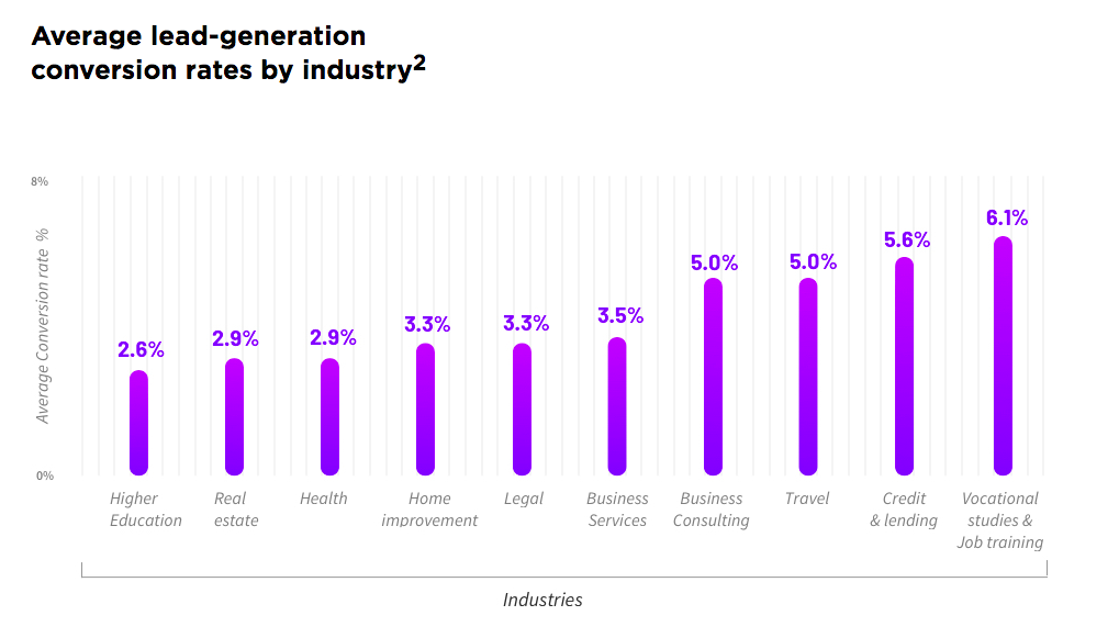
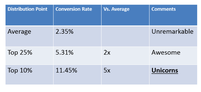
Finally, as you can see average conversion rates remain in the low to mid single digits, but superior conversion rates are achievable. For example, the team at WordStream analyzed the performance of the top 25% and top 10% of landing page conversions.
“You should be shooting for 10%, 20%, or even higher, putting your conversion rates 3x to 5x higher than the average conversion rate. Aspire to have these landing page conversion rate unicorns in your account.”
So, how do you achieve these results? Essentially, review the key elements and A/B test your campaigns to improve landing page conversion rates.
What are the best tips to improve my landing page conversion rates?
Fortunately, there are plenty of experts that share how to improve landing page conversion rates and support the various concepts about engaging with potential customers.
Trigger Human Emotions
“Fear of missing out is a hot topic these days and for a good reason. If you can trigger an emotional response from your audience—whether it’s fear, excitement, etc.—you will be more likely to convert that lead with your landing page. Use emotional triggers to convey a sense of urgency, a fear of missing out on something important, or anything else that will motivate them to click your CTA.” – AgileCRM
Use Scarcity to Drive Action
“There’s a reason why “limited time” and “limited quantities” are among the most common marketing phrases. Scarcity compels your landing page visitors to act now because they know they might miss out if they wait. Even big box stores use it. When buying a product from Target the other day, I knew I wanted to pick it up at my local store. Do the same on your own website by activating a limited-time discount or offering a lead magnet, such as a live webinar, that won’t ever occur again. A countdown timer can add a visual element to scarcity. It tells your visitors how long they have to act on an offer.” – Crazy Egg
Ensure a Clear Call to Action
“Make sure the CTA is displayed at least once in a visually distinct, centralized, and obviously buttony-looking button. Don’t make people guess at what they should click on. Use visual cues, such as arrows or images of people looking at the button, to draw the eye. If you have other CTAs on the page, de-emphasize them visually compared with the primary CTA. If you have content below the fold, repeat the CTA. Always make it easy and compelling for the visitor to take the desired action.” – Neil Patel
Change the Offer Over Time
“Across all of the high-performing landing pages, we saw massively creative and differentiated offers. Companies often have a default offer, their go-to, which may be the same or very similar to what all of their competitors are doing. Lawyers, for example, will offer a free consultation. Software companies will offer a free trial. They’re unimaginative and not very creative.” – WordStream
Highlight the Most Important Elements “Above the Fold”
“People spend 80 percent of their time above the fold. You’ll need to strike a balance: You want as much content as possible above that imaginary screen border, but you don’t want to clutter up the visual field.” – Entrepreneur
Showcase Trust in Your Company
“In this age of rampant identity theft and information security breaches, consumers are – understandably – wary of giving out their personal and financial details online. And although online purchases are becoming more standard than they were even 5-10 years ago, the trust barrier is still a hurdle you’re going to have to overcome in order to improve your landing page conversions. A Stanford study found that 46 percent of web sales are lost on sites lacking the critical elements to build trust, so consider these two key factors with regard to your landing page’s trust level: appearance and credibility.” – SingleGrain
Understand Your Own Goals
“You’d think the goal is obvious, but what we’ve found is that one of the biggest problems with most landing pages is they lack focus on one particular goal or CTA. Many landing pages have multiple offers which confuse users and make them lose sight of the conversion aspect of the landing page. It’s key to create landing pages that focus on only one offer or solution; this way, your users don’t lose sight or get confused.” – MarketingLand
Review (& Improve) Contact Forms
“And your short forms too! Forms should ask for minimal information (only what you need!). Plus, forms should be clear, easy to complete, functional, responsive by design and provide trust signals and support information.” – SearchEngine Journal
Heat Maps Track Behavior
“Heat maps aren’t the only visual data reports that can prove effective for landing page optimization. Scroll maps, confetti maps, overlay reports, and list reports all provide valuable information. A scroll map shows where scrolling activity occurs on the page. If you see lots of white or blue on the map, people have either left the page or scrolled quickly past that section. Red, orange, and yellow areas indicate that people have stopped to read or look.” – Crazy Egg
Cross-Promote on Social Media
“You should always use social media to expand the reach of your landing page offer. Additionally, draft regular posts to your followers. Also, boost posts for extended reach. Or, you can use social advertising—such as Facebook ads—to put your offer in front of more eyes.” – AgileCRM
Design for Eye Movement
“Since you can’t always be physically present for potential clients visiting your site, try the next best thing for directing their attention to what’s important: directional cues. Landing pages are not read like a book, which is why directional cues are essential for showing the visitor how to read it. Directional cues can range from arrows blatantly pointing towards the information you want the visitor to see, to more subtle ones such as the person in the image looking at the call-to-action button. Previous studies have shown focus levels more than doubled when directional cues were used on a landing page.” – HubSpot
Keep a Narrow Focus
“AKA Keep It Simple, Stupid. Research has shown that the more choices you offer people, the longer they take to make a decision. So the clearer and simpler you make your page, the more likely you are to get someone to take the action you want.” – Neil Patel
Use Remarketing as a CRO Tool
“On average, 96% of the people who visit a website will leave without ever converting to a lead or sale. Remarketing helps you get in front of these people with targeted, relevant messaging as they take part in other activities around the web, like email, watching YouTube videos, using social networks or searching for information.” – WordStream
Optimize for Lead Generation
“When you go and open a new bank account, I’m certain you dread it as much as I do because it means pages and pages of forms. If they could take an approach like marketers do and just get the email address, that’d be great, right? Draw on your hellish experiences at the bank and don’t put your prospects through the same trouble: Keep forms to the absolute bare minimum number of fields. I can’t tell you what the minimum number of fields you need for your business. If it’s to opt-in for your email list, then you need only their email address. Lead capture forms are trickier, but experiment and try removing fields while maintaining the same level of lead quality.” – ReliableSoft
Avoid “Auto-Pilot” Pages
“Nili Zaharony of Penguin Strategies thinks “it’s easy to go on autopilot when creating landing pages. Duplicate a previous landing page, update the text so it reflects the new offer. With so many different tasks on our plates, it’s easy to take these shortcuts. What suffers the most is the value proposition,” Zaharony explains. But instead of running on autopilot, Nili recommends to “take a moment to step back, think about what value you’re giving away, why people should care and ask if it’s worth the amount of information you’re requesting in your form.” – DataBox
Create Personal & Relevant Pages
“This may seem more involved than a page tweak, but for me, this is an imperative stage for any hopes of converting a decent volume of landing page visitors. When you are ideating content it should be created with the user in mind, reflecting a clear purpose. This will improve the performance of the page covering initial content discovery and understanding, right the way through to usability and conversion rate optimization. You might find it easier to break down your site into main content types and set out frameworks and approaches for each.” – SearchEngine Journal
Test Incremental Changes
“Sometimes businesses are so focused on revamping their landing page that they forget to think from a client’s perspective. Complete landing page redesigns can lead to confusion and stress for clients who previously felt comfortable and confident when visiting your page. In some cases, a complete redesign has caused up to a 20% drop in conversion rates. Instead of letting this happen, ease them into the process with gradual improvements that excite and educate them one step at a time. Additionally, incremental changes allow you to monitor precisely which changes triggered an increase or decrease in conversion rates, rather than just guessing which features of your complete revamp had the greatest effect. By gathering data and using that data to make incremental changes to your landing page, you will know more precisely what the cause of a drop off was and then reverse it.” – HubSpot
Examples of Great Landing Pages
The difference between a marginal landing page and great landing page can be subtle, but make a huge difference in conversion rates. Fortunately, plenty of outlets share examples of great landing pages, which help marketers improve their conversion rates and ultimately, drive more revenue!
First, most companies run AdWords campaigns looking to drive new customers. As a result, the landing page for an effective sign-up pages needs to capture attention in a simple format. To help, HubSpot rounded up a handful of great sign up landing pages. Ideally, marketers aiming to improve their landing page conversion rates will learn a few tips from these examples and integrate them into their campaigns.
1. Shopify
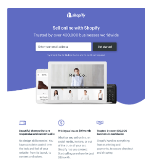
Shopify helps e-commerce companies streamline their operations and sell merchandise online. As a result, free trials are imperative to converting new business development and their sign-up landing page hits on the simplicity of the platform by emphasizing simplicity in its design.
“Like many of the other landing pages in this post, Shopify’s trial landing page keeps it simple. The user-oriented headline is just a few words, for example, and the page relies on simple bullets, not paragraphs, to communicate the trial’s details and benefits. There are only a few fields you need to fill out before you get started. All of this makes it easier for you to get to the point: selling online with their tool.”
2. Wistia
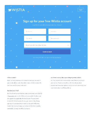 Wistia offers businesses an alternative to YouTube and allows companies to own their online videos. For any platform that competes with an 800-pound gorilla in any industry, ease of use and simplicity of switching provides must be the focus. As a result, the clean sign up form (matched with FAQs for people questioning the platform) make a great landing page design.
“First up is Wistia’s landing page for their Free Wistia Account. Right off the bat, you notice the one-field form to create your account — the blue, minimally patterned background contrasts nicely with the bright white form field. The length of the form field combined with the prominent placement eliminates nearly all friction to create an account. But, if you’re having doubts, you can always scroll below to read answers to top FAQs. By separating these two sections with stark color contrast, Wistia makes it much easier for you focus on converting.”
3. Webflow
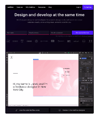 Webflow offers web developers with an easy to use design tool. Developers and designers tend to be different groups, so the landing page does a nice job of demonstrating the easy design nature of the platform through the sign up form.
“Having the entire sign-up form on a single line is a nice touch here — not only does it make the page shorter, but filling out each box from left to right shows users how close they are to clicking the fourth blue button and getting started for free. The animated GIF below the form is visible in the same frame on the website, so users can see how the product works and sign up without scrolling or clicking over to a new page.”
4. TransferWise
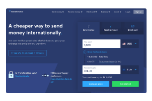
Many companies struggle with landing page design because they have complicated services. TransferWise provides a platform to send or receive money, which means visitors have multiple use cases for using the software. As a result, the design behind the sign up page helps differentiate the various use cases in a simple format.
“TransferWise allows you to send and receive money in different currencies, and its landing page, shown below, separates each individual action so you’re not distracted by options that don’t apply to you. If you want to send money, the transfer form is right there on the right for you to fill out. To receive money, simply click to the middle tab, and to sign up for TransferWise using your debit card, click to the far-right tab. Each tab on this landing page produces a different call-to-action based on what you’re signing up for — each of them in a vibrant green box to highlight your next step after your three possible starting points.”
5. Airbnb
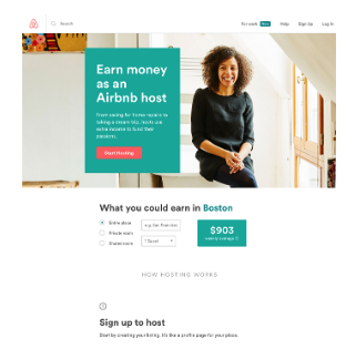
At this point, many (if not all) people know about AirBnb. However, AirBnb still needs to grow its customer base and convince people to sign up and host travelers. As a hosting platform, AirBnb offers a clear call-to-action about earning money to help convince individuals to turn their home into a rental property. The landing page provides an easy form that informs people how much they can earn and ultimately, drive sign-ups (and new hosts).
“To help convert visitors into hosts, Airbnb offers some enticing personalization: an estimated weekly average earnings projection based on your location. You can enter additional information about your potential accommodations into the fields to get an even more customized estimation. If you visit the page already convinced, the clear call-to-action at the top of the page makes it easy to convert on the spot.”
Secondly, once your team creates an impactful landing page and the team remains satisfied with the design, focus on your conversion rate. To start, look at your analytics (and even heat mapping if your site tracks hot spots) to understand how your landing pages drive traffic. Most campaigns have multiple landing pages, so you can compare metrics between pages. For more, Use Proof offers some tremendous examples of landing pages with impressive conversion rates. Ideally, marketers can note a few common elements of these ultra successful pages and incorporate into their own landing pages.
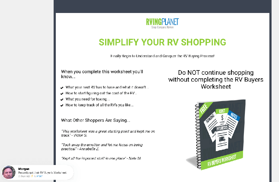
RVing Planet helps consumers complete the buying process journey from research to purchase of an RV. The landing page features a free guide (which is very common and powerful) that provides a “free gift” to users. As a result, the page converts at roughly 73%!
Additionally, part of the high landing page conversion rate derives from a minimal background design and prominent call-to-action button. Finally, the page puts a lot of emphasis on economic incentives and authentic testimonials. All of these factors contribute to a highly performing landing page.
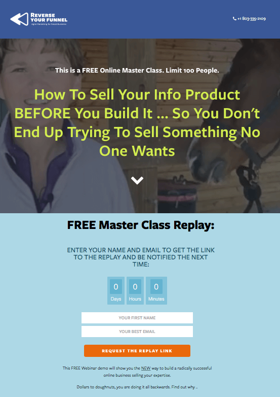
Reverse Your Funnel provides webinars to small business owners looking to understand marketing. The webinars provide marketing tips along the lines of a minimum viable product with an emphasis on marketing prior to a product. Again, the landing page features a simple call-to-action and form fill to receive updates about the next webinar.
As a result, the page converts as an incredible high 60%, which is above and beyond the industry average. Part of the high conversion rate relates to the scarcity incentive (by featuring the countdown clock) and exit popup (which offers another opportunity to sign up and improve the conversion rate).
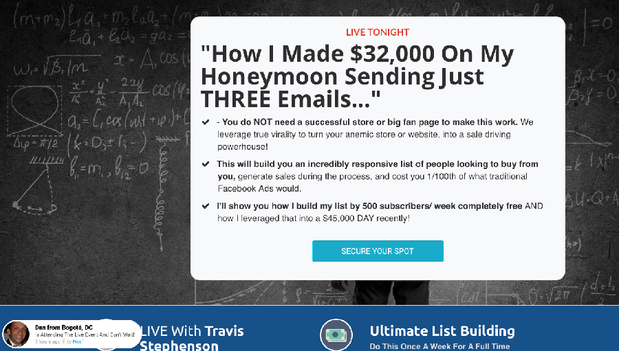 One of the most effective marketing trends is customer communication. Wealthery helps teach business owners how to leverage chatbot and other software tools through live webinars. As a result, Wealthery offers bootcamps to teach owners about these software tools and places a huge emphasis on profit potential to drive an incredible high 68% conversion rate.
The landing page converts so well because it features a prominent headline that really captures the visitors attention. Pulling on greed and profit potential matched with scarcity (limited time to attend the webinar) helps drive a huge conversion rate.
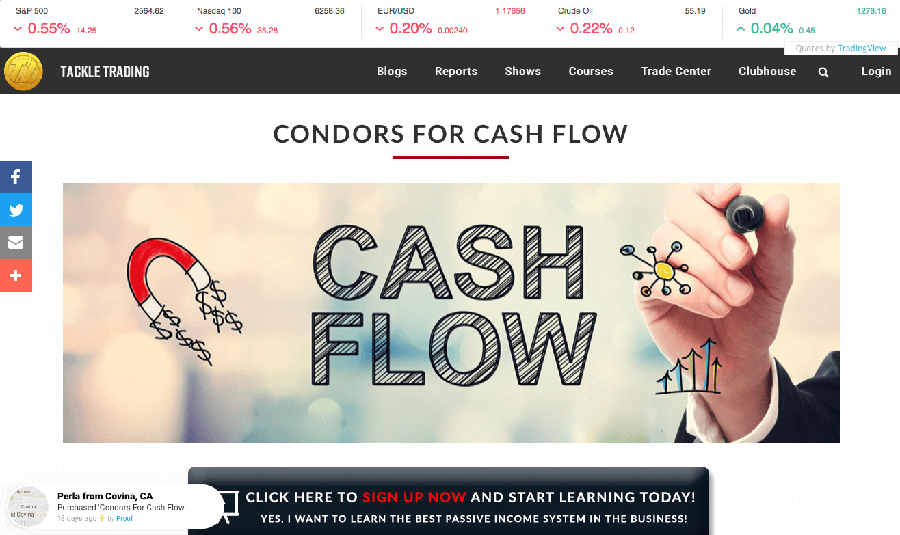
Tackle Trading provides online courses and other educational resources to help people trade and invest. For a company that operates in the greed space, many people are already drawn to the potential opportunity of getting rich. However, the landing page converts at a roughly off-the-charts 85% because it offers a simple call-to-action. Click to start learning about the markets offers a simple ask and helps drive the distribution list for Tackle Trading (and help improve their email marketing campaigns).
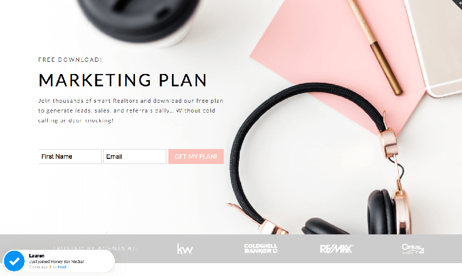
Honey Bar Media focuses on the real estate industry and offers a variety of services that help real estate agents. The landing page helps drive adoption of the free marketing plan download. Again, landing pages with a free download produce increased conversion rates because visitors get an immediate reward.
The landing page converts around 65% because it features many of the common elements of any great design. For example, the page includes minimal background design, a simple headline and authentic testimonials. Finally, the page maintains an exit popup to capture the visitors that initially pass on the free download.


